WEREWOLF BY NIGHT #1, available from Marvel Comics on October 21st, re-introduces and reinvents the titular character for a new generation. Written by Taboo and B. Earl, this new take casts off the Jack Russell character in favor of a Native American teen named Jake, who uses his lycanthropic talents for vigilante justice on the reservation.
Cover Art
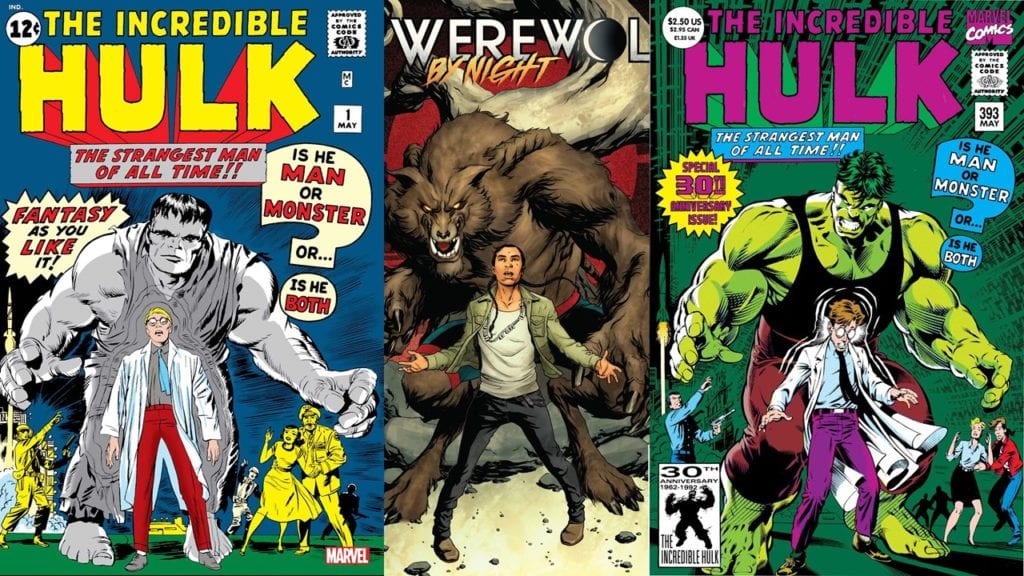
Mike McKone and Jason Keith’s cover is exceptionally well-drawn, inked, and colored. What’s most notable is the composition. Long-time Marvel fans will notice the cover looks oddly familiar, and that’s because of both the cover and the story inside echo another, much more recognizable Marvel character. Can you guess which one? If not, head on down to the writing section.
Writing
If you’re a Werewolf By Night fan since the character’s origins in 1972, be forewarned. There is no connection between the original Werewolf By Night and this issue in any way except the title. I’m a fan of the original character, but I appreciate not trying to reproduce what’s come before and accepting a fresh, creative vision.
Does this bold, new take hold up? Yes and no.
Taboo and B. Earl have put together a solid story, but it’s really not a werewolf story. If you hadn’t guessed from the not-so-subtle hints dropped in the Cover Art section, this is almost beat-for-beat an MCU Hulk story. Jake, the werewolf and male lead, has the ability to change into a werewolf at night, partly motivated by emotions such as anger. His female friend (not girlfriend… yet) manages to keep him calm and focused on the task at hand through auditory cues such as music. Again, this is almost an exact replica of the Hulk/Bruce Banner relationship with Black Widow in the Avengers films.

Is that bad? No, but it doesn’t read as horror or necessarily unique in the character dynamics. I like the Hulk-Black Widow relationship in the films, so this works on that level.
For the plot, Jake and his not-girlfriend, Molly, patrol the reservation at night, attacking trespassers. Jake soon suspects the higher-ups at this day job in a research lab are up to no good, so he and Molly decide to take matters into their own paws. It’s standard fare to have two headstrong teens, especially one with superpowers, go after the bad guys on their home turf, but what strikes as odd is the police’s complete lack of engagement. Normally a reservation would be under the jurisdiction of the Bureau of Indian Affairs (BIA) police. Still, Jake and Molly make no attempt to inform the BIA of relatively harmless trespassers or about fishy shenanigans at Jake’s company.
Further, Jake and Molly seem unsettlingly cavalier about using violence, to possible lethal effect when Jake attacks the convoy, without much cause. And that’s the part that generally doesn’t work. There’s no dramatic tension. No turmoil over Jake’s curse. No struggle to accept who he is and how to control the beast within. It’s as if Jake woke up to the fact he’s a werewolf one day and said, “well, let’s go beat up some bad guys.” It’s all very antiseptic and completely devoid of dramatic punch.
It’s a good story structure and pacing but emotionally flat.
Pencils/Inks
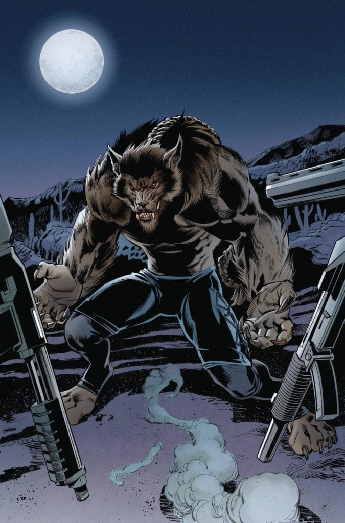
Okay, let’s get to the most important artistic piece first- how does the werewolf look? He looks great. Ignoring my own warning about not comparing to the original, this werewolf is a massive improvement.

Scot Eaton and Scott Hanna went for the “beast that walks on two legs” approach that’s more The Howling (1981) than Lon Cheney Jr’s The Wolfman (1941), and Jake’s feral form is powerful and menacing. The long, tribal braid is a nice touch to give the werewolf a little flair and distinction.
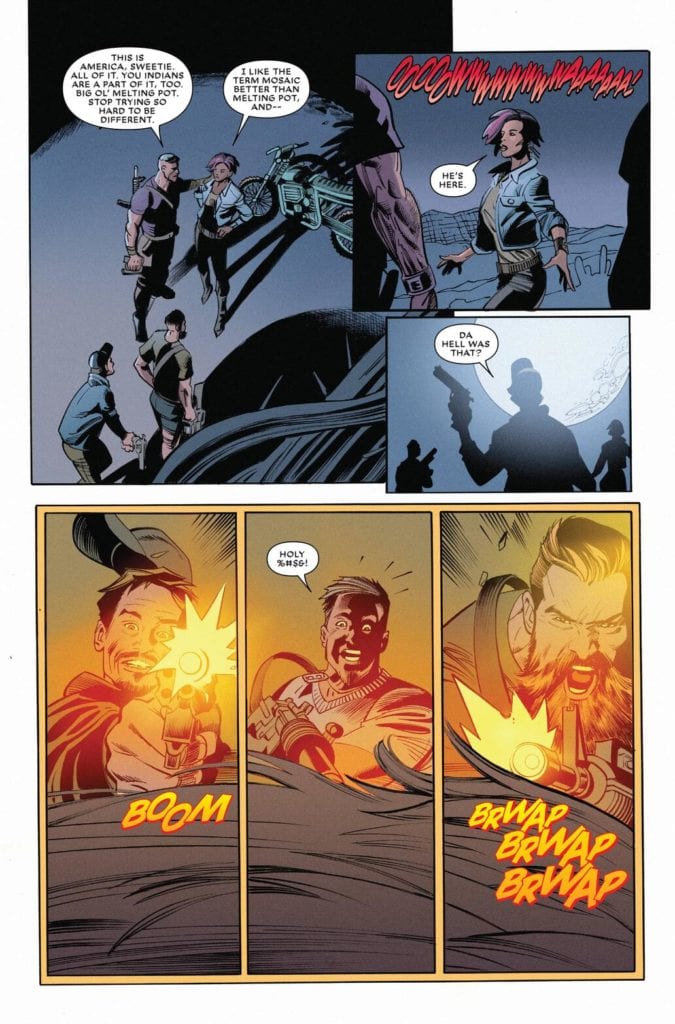
Better still, Eaton and Hanna hit you with high-momentum action art. When the werewolf moves, you can feel the predator on the attack. When the werewolf is chasing some cars (it’s not as cliché as it sounds), the chase is exciting and energetic. When the werewolf attacks trespassers in the opening sequence, the slashes are swift and brutal. Eaton and Hanna not only created an intimidating monster but a dynamic action fighter. Nice work by Eaton and Hanna.
Coloring
Miroslav Mrva nails moonlight coloring and glow. Most of the major scenes take place in the moonlit desert, and the shading of the characters, the sky, and the surroundings feel completely authentic to that eerie glow that only comes from moonshine. I hope the editors keep Mrva on for the rest of the series.

Lettering
VC’s Joe Sabino’s lettering was adequate for the story, but the word balloons looked overstuffed in spots. Perhaps it was the font choice, but it would have been easier to read if the text was broken up into manageable chunks. On the plus side, the lettering placement is excellent, and the word(y) balloons didn’t affect pacing in any noticeable way.
Conclusion
WEREWOLF BY NIGHT #1 reads more like a Hulk story than a horror comic, it’s a standard action plot with exceptional artwork. I would recommend this to anyone with an insatiable hunger for werewolf entertainment.

