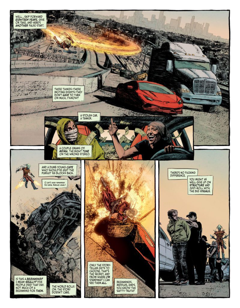
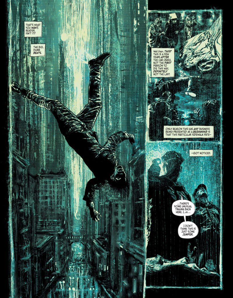
Suicide Squad: Blaze #1 starts by contemplating where a story should begin. The narrator, with a proverbial finger flipped to the reader, eventually gives up trying to figure out where to start and just begins giving us what we want: “The big, dumb beats.” Suicide Squad: Blaze #1 is a comic that plays by no one’s rules. It turns its nose up at being defined or picked apart. Writer Simon Spurrier, artist Aaron Campbell, colorist Jordie Bellaire, and letterer Aditya Bidikar have created a story that’s as wild, rebellious, and aggressive as its characters.
About Suicide Squad: Blaze (from DC Comics):
The attacks begin without warning. Brutal, sudden…cannibalistic. A metahuman with all the power of Superman but none of his humanity. An unstoppable being ruled only by hunger and instinct, striking at random across the world. To stop this threat, Harley Quinn, Peacemaker, Captain Boomerang, and King Shark have been assigned to corral, nursemaid, and if necessary execute five deadly new recruits: the expendable products of a secret government procedure called BLAZE. They’re ordinary prisoners, endowed with incredible power… and the certain knowledge that it’ll burn through them like wildfire. They have six months to live, maximum.

Writing
Spurrier’s tone is irreverent and aggressive. He’s hostile towards the reader, almost mocking them for picking up the comic in the first place. He skips through to the important bits, narrating about his impatience for the story to get going. Of course, this is all actually done through the voice of Spurrier’s main character, Michael Van Zandt. But it’s a brilliant reverse psychology that pulls the reader in. And while there’s plenty of aggression to be felt from Van Zandt and some of the other characters, there are little moments of levity and humor that happen on the sidelines too. Like when King Shark puts his hands over his nose at the smell of blood, quietly telling himself to keep it together. Spurrier creates an overall mood for this issue, for sure – this reads like a comic that’s been backed into a corner and is swinging at anyone who gets close – but he also shows incredible range with his characters. From the psychotic to the well-meaning. From the suicidal to the homesick. There’s so much to love and fear in each of them.
Art
I could talk for days about Campbell’s incredible art. You can smell his grimy prison cells, feel the texture of the desert sands on your fingertips, and taste the rain in the air of his gloomy Gotham nights. His characters feel layered. At first glance, many of them often look emotionless. Yet, behind their eyes is a deep-seated hatred that still shines through. These are characters who have their walls up. And Campbell’s art doesn’t stop inside the panels. He makes an art of his page layouts too. The panel borders for much of this comic have a slightly uneven border to them, looking like they were actually drawn on with a black pen. One page, depicting a rainy night, actually uses the rain to create the edges of each panel. Campbell’s art feels like it’s barely contained, bursting at the seams and trying to get out.

Coloring
A big part of this story is about the destructive nature of power. Power itself is often shown in a brilliant green that crackles across the page. When the main characters have powers bestowed upon them, the room is cast in a green light. And then three of those characters awake with powers that manifest in dazzling lime colored energy clouds. But even before the characters have their new gifts, there are pages that have a sickly green hue to them. These pages almost look as though they’re beginning to rot, like gangrene is setting in. Bellaire seems to be saying that even the promise of power corrupts. Her pages are stunning and disturbing all at once. Moments of extreme violence are rendered in a breathtaking mélange of colors, looking more like a painting by Cezanne than a comic book page. Bellaire is the perfect fit for a comic that’s finding beauty in the most unlikely places.
Lettering
Bidikar gives Van Zandt’s narration of events a really natural feel. When Van Zandt is saying something that’s beside the point, or something he doesn’t really care for the reader to notice, Bidikar writes in small, lower case lettering. You can hear it like Van Zandt is saying it under his breath. Bidikar’s sound effects are shown in a scratchy, thin lettering across every page. It matches the feel of the book perfectly. One “SKOOSH” noise in particular, the sound of someone’s head getting caved in by a mallet, looks like it’s being formed by the blood in the scene. Bidikar brings even more flavor and fun to every scene.
DC Comics’ Suicide Squad: Blaze #1 is a no-holds-barred, brutal, brilliant issue. This creative team will disturb you and delight you in equal measure. You don’t want to miss this raucous, wild new series – even if it has you reading it from between your fingers as you try and cover your eyes. Pick up Suicide Squad: Blaze #1 at a comic shop near you!

