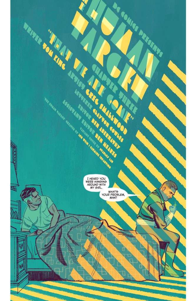
There’s something so enticing about The Human Target. This series, from DC Comics, plunges you into the dark world of Christopher Chance. Chance, who works as “The Human Target,” is investigating the Justice League International. These characters, who all starred in 1987’s treasured run, seem bright, fun, and occasionally a little simple. But Chance isn’t fooled by any of it. He’s ahead of the curve, a force to be reckoned with. Yet still, beneath Chance’s own cool-headed façade, he can still be a self-destructive fool. Writer Tom King, artist Greg Smallwood, and letterer Clayton Cowles will play with your mind and heart in The Human Target #3. Because, after all, can’t we all be a little self-destructive?
About The Human Target #3 (from DC Comics)
Christopher Chance is a man on a deadline and working to solve a crime that might be unsolvable. Despite his better judgment, he’s falling for his lead suspect, and her violent ex-boyfriend isn’t happy about it. Oh, and that ex? He’s a Green Lantern.
Writing
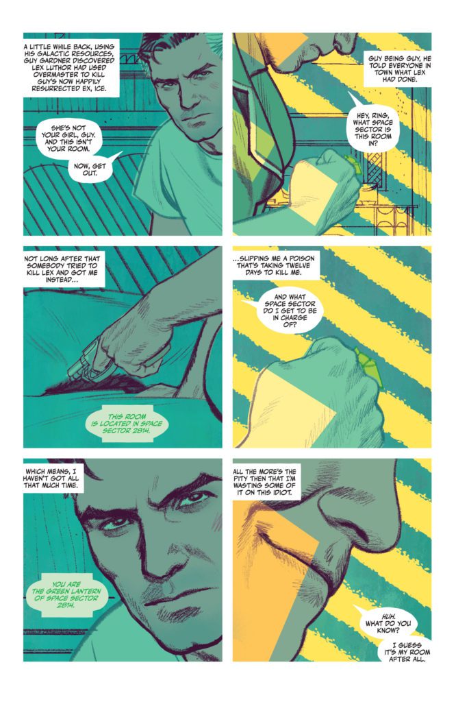
Christopher Chance, the Human Target, is a professional. You can see it in the way he carries himself. You can hear it in the coolness with which King writes Chance’s thoughts. But Ice is cool too. And King shows us in this issue just how much she’s getting under Chance’s skin. In the opening to this issue, Chance gets visited by Ice’s “violent ex-boyfriend,” Guy Gardner. Gardner is everything that Chance isn’t. He’s a hot-headed, quick to judgment, “shoot first, ask questions later” kind of guy. He’s the kind of man who can make a mess of things when he puts his mind to it. So it’s funny that the next time we see Chance, he’s still got Ice tagging along with him. King clearly sets it up for us: Ice is trouble, whether that’s her fault or not. If Chance wants to solve this case before his impending demise, it’s best to shake her. But that’s exactly what King is saying. Chance can’t shake her. And the self-destructive voice in the back of his head – the auto-pilot voice that his conscious mind is railing against – is telling him that maybe he shouldn’t even try.

Art & Coloring
When we first see Guy Gardner, he’s a huge presence. Smallwood shows Gardner from the chin down, as he grins a little. With this, Smallwood does two things. He makes Gardner feel very big on the page. And he creates a power dynamic between them. Gardner is above Chance. He’s looking down on him. Then, as the issue progresses, Smallwood puts Chance and Gardner on the same level. Sometimes, Smallwood even makes Gardner look small and weak on the page. He shows panels of Gardner standing far away, so that all his threats feel just a little less menacing. But that’s just one of the many ways Smallwood tells such a smooth story in the visuals of The Human Target. In fact, these pages feel like they’d be more at home in a pop-art gallery of a museum, than in a comic book.
Smallwood’s colors have a stunning depth to them. When Chance parks his car out in the street, on a late night, his headlights create a beautiful pattern across the panel. Smallwood’s incredible impressionist-style use of light is jaw-dropping. But he’s also playful with his coloring. When he creates a gag of Booster Gold running across the page, each panel a flashback to a recent time travel escapade, the colors are flat but bright. Smallwood drops all sense of realism in these panels to help this moment pop. It’s whimsical and funny. Even the return back to reality, in the bottom two panels of the page, feels like cause for a chuckle. Smallwood’s art and coloring, together, make for some of the most breathtaking work in comics. He’s on an entirely different playing field. His peers aren’t even legends like Kirby, Lee, or Ditko – they’re Warhol, Cezanne, and Turner.

Lettering
The sound effects of this issue seamlessly blend with the art on each page. When Chance throws a punch at Gardner, and it’s blocked by a brick wall, the “THUD” noise almost seems to smash up against the wall too. The U and D get much thinner than the TH, brought to a stop by Chance’s fist making contact. But there’s so much more to Cowles’ lettering than the brilliant sound effects. For one thing, the placement of Chance’s captions tells us a lot about him as a character. On one page, he’s fighting with Gardner. His captions are all in the top left corner of every panel. But when the fight is over and Ice enters the scene, his captions sink to the bottom of the page. Cowles shows us how Chance seems to relax around Ice. He lets his guard down and settles. Cowles shows us that Chance isn’t the bitter bastard he wishes he was. He’s got a beating heart behind that rough exterior, and his thoughts are proof of that.
DC Comics’ The Human Target is delightful. You’d be hard-pressed to find a team that works together as brilliantly as Tom King, Greg Smallwood, and Clayton Cowles. With a smooth script, gorgeous pop-art style visuals, and a subtle rhythm to the lettering, what’s not to like? The Human Target #3 is just another example of this creative team’s unmatched brilliance. Pick it up, out from DC Comics December 28th, at a comic shop near you.

