For many comic book readers or fans of X-Men the Animated Series, Sabertooth has never been the type of mutant to devise a plan. Instead, he’s primarily used as a vicious killer or a thorn in Wolverine’s side. On occasion, like Uncanny Avengers, he was a good guy, but mostly he is the villain. So how do you write a book where we root for the villain?

WRITING
Victor LaValle has done an excellent job of fleshing this book out. Adding other characters to the pit allows Sabertooth to have allies to play around with. Where LaValle shines on this issue is in his character interactions. The conversation between Nekra and Oya is incredibly well written and honest. LaValle allows us to see that both characters are self-aware and know they can’t trust Sabertooth. Nekra brings up the point that after being thrown in the pit, can she even feel comfortable on Krakoa anymore. This line runs more profound than many comic book lines and speaks volumes. There is also a conversation that happens between Madison Jeffries and Skin. LaValle uses this to show that mutants who appear normal may not be as comfortable as we believe. LaValle takes a book about a killer and makes it a heartfelt and sympathetic story. Sabertooth is in this story, but the story is about so much more.

ART
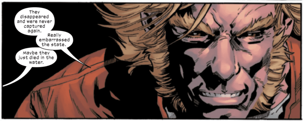
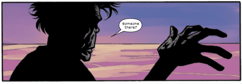
The pencils by Leonard Kirk work wonderfully here. Kirk will use a close-up panel of Sabertooth’s face to emphasize his point as he tells a story. Kirk also gives us a nice-looking silhouette of our characters as they drift down the river at night. Kirk’s work is strongest when it’s simple. He allows the reader to glide from panel to panel without getting too bogged down in detail. The characters are the essential element in this issue, and Kirk puts a lot of emphasis on that. His work is intimate and allows us to get into the face of the characters we’re reading about.
The colors by Rain Beredo match up nicely with Kirk’s pencils. Beredo’s backgrounds use striking teals and pinks as our characters travel the landscape. These colors allow the characters to pop out on the page. Beredo uses excellent contrast in the light backgrounds and the tone of the heroes. The shading in this issue is effectively used as well. As Mole enters a room to visit Third Eye, his face is shaded, and his glasses are visible. This is an interesting panel that will absolutely catch your eye.
Cory Petit handles the lettering for this issue. This is essentially a pretty standard-issue as far as letters go. There are a few instances where a character screams, and Petit enlarges the font to show pain. Petit also uses a distorted word balloon as a character begs. Word balloon placement works. One panel is never overloaded with too much dialogue. As far as lettering goes, Petit continues to work his magic.

CONCLUSION
Sabertooth #3 is another interesting entry in the series. It’s nice to see Creed in a different role instead of just a vicious killer. LaValle does a remarkable job of humanizing one of comics greatest psychopaths. The artwork brings the story to life in a realistic and intriguing way. Sabertooth #3 is out now, and available at a comic shop near you.

