Reptil #1, out now from Marvel Comics, gives new life to the character and sets up a fun and fast-paced adventure.
 Terry Blas writes Reptil #1 in such a way that the series welcomes readers unfamiliar with Reptil with open arms. There is a quick and concise retelling of Reptil’s origin and the introduction of new conflicts for the character. Blas keeps us entertained throughout the entire issue with twists, turns, and a gripping cliffhanger to end it all. Not to mention the way he is able to address the serious problems the characters are facing while also making much of the issue feel light-hearted. Blas also has the main characters use Spanish phrases throughout the issue, which adds to their character and makes them seem more three-dimensional.

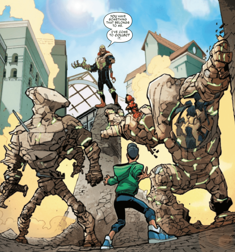
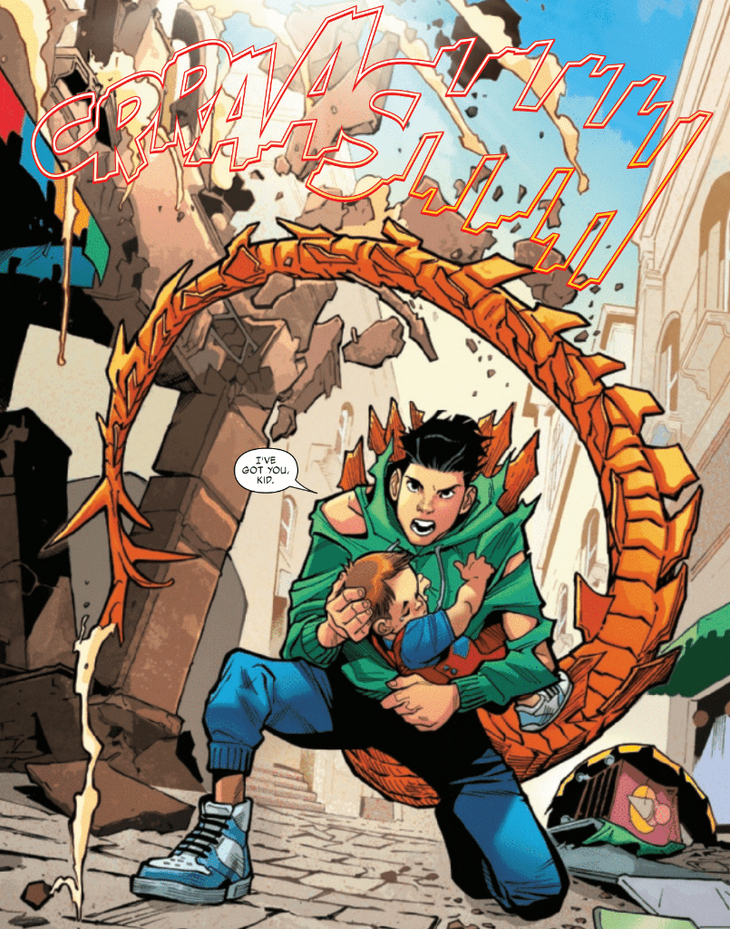
The pencils of Enid Balám and the inks of Victor Olazaba give Reptil #1 the fun feel it needs. The style features emotive and cartoonish figures that allow for a pleasant tone for much of the issue and serious moods when the story calls for it. The figures in this issue are also incredibly dynamic, which causes fight scenes to draw you in easily.
Reptil #1 benefits significantly from Carlos Lopez’s use of color. The entire issue has a broad color scheme, which causes the story to feel energetic. At certain moments, Lopez chooses to have a single color dominate a panel, which is a highly effective way to make the mood of a scene clear. This technique isn’t often used, which helps make the moments where it is used more impactful.

VC’s Joe Sabino’s lettering talents do wonders to help the story in Reptil #1. The lettering is standard for many moments, but when things get heated, the lettering changes to reflect that. By having moments where the lettering isn’t very eye-catching and moments where it is, Sabino creates a contrast that is certain to catch the reader’s attention, especially when Sabrino provides some stunning choices for sound effects during fight scenes.
Reptil #1 is a fantastic reintroduction to the character that starts a new intriguing storyline while also filling in new readers into what happened before. The art is light and enjoyable and perfect for a series of this style. If you want to join in on a wild adventure, be sure not to miss this excellent start to a new series.

