Body horror and petty crime open up the first issue of IDW Publishing’s new title Mountainhead which hit stores this week. A dark humoured tale of consequences populated with an array of disturbing characters: Mountainhead doesn’t set out to make any friends.

Scaling The Mountain
The opening page of the comic is the most disturbing visual in the comic. From the very beginning John Lees wants the reader to know what kind of story they are getting into.
The image is gruesome and not easy to decipher. There are the remains of numerous people jumbled together, scattered across the crisp white snow as if they have just fallen from a torn bag made of human skin. This is matched with a nihilistic voice-over of a child who turns out to be the main protagonist.
Without doubt, a stark, blood soaked, eye-catching opening.
From there John Lees introduces the reader to the character of Abraham and his paranoid father through a series of house break ins and dodgy hotel stays. Their relationship is one built on mutual respect and dependency. It is made clear that the father/son relationship only exists because of the psychological manipulation of the youngster. Abraham is ‘required’ by his father and made to feel guilty if he desires a different life.
John Lees gives the two character’s distinctive voices and Abraham’s is clearly the more reasonable, constantly reassuring his father and acting like a hostage negotiator. His calming tone comes through the cleverly selected speech and sentence structure. In contrast his father’s speeches ramble on, long winded, paranoid rantings. He is a man under pressure and, most likely, already passed breaking point.
When the story moves away from the down town crime narrative it becomes less engaging. The towns folk Abraham meets in British Columbia are caricatures with little substance. John Lees doesn’t give the reader time to adjust to these characters instead concentrating on an attempt to create a Twin Peaks like atmosphere. The narrative moves too quickly through Abraham’s new life, not giving him or the readers time to adjust. It is as if the writer can’t go a scene without including something out of the ordinary.

Carving Out The Mountain
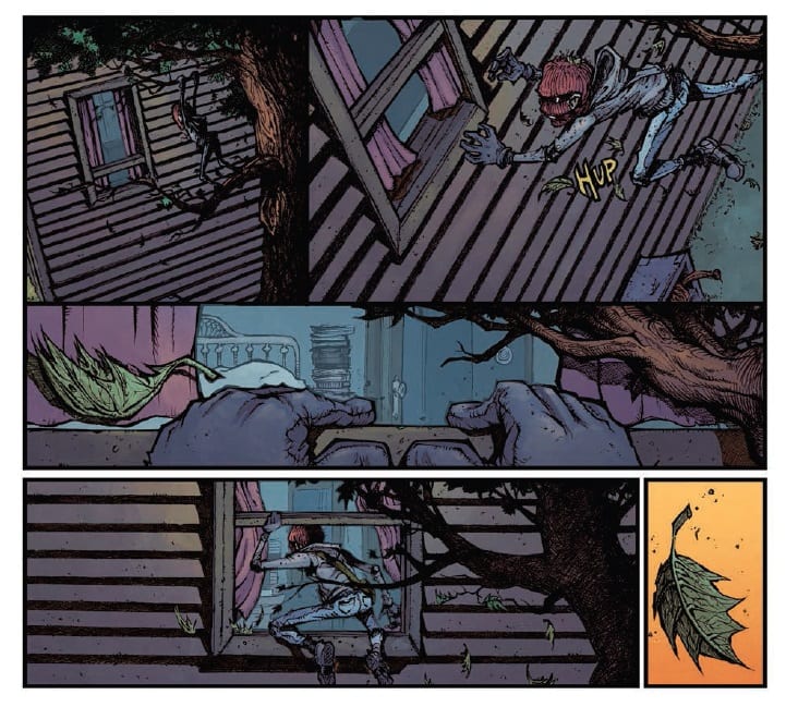
Ryan Lee has a distinctive style. His characters have over exaggerated features creating highly detailed caricatures. The faces of the cast take on the most prominent aspects of their personalities, in a similar way that the villains from Dick Tracy did in the 1940’s.
Abraham has a simply innocence to him, with a small stature reflecting the years he has spent at the psychological mercy of his abusive father. The rest of the characters each cast their distinctive shadow across the panels making them easily recognisable.
Ryan Lee’s artwork is playful and brings out the dark humour that runs through the narrative. However, the accentuated figures highlight some of the personality deficiencies from the script. Visually speaking the characters are wonderful but some of them lack substance.
As with the script, the lettering has highs and lows. Doug Garbark gives the speech balloons a soft edge, lacking a black boarder, which integrates with the art very well. There are also some irregularities with the shape of the balloons or the text within them that gives the speech emphasis and even added humour.
Whereas the irregularities add to the storytelling some of the placements create inconsistencies. In one panel two characters may be separated by the speech, creating a natural wall insinuating a distance between them but this disappears almost straight away. The speech moves to the edges pushing the character’s together even though nothing has changed in the relationship.
There is also the matter of the caption boxes changing color. This happens on the very first page, different colors are used even though there is a single speaker. This causes confusion in the reader which effects the pacing of the story.
The coloring across the rest of the comic, provided by Shawn Lee is wonderful. He adapts his color pallet to match the scene as it plays out. This requires realistic coloring on some pages and hyperbolic shading on others. Red washes flood violent or disturbing panels just as the night scenes are dulled with greyish blues.

Conclusion
Mountainhead has some strong storytelling techniques and expressive art work. The page layouts lead the reader dramatically through a page while the coloring sets the scene and atmosphere. However, the expressive artwork doesn’t help to cover up areas of character lacking from the script. The pacing is often broken by inconsistencies causing unwanted pauses and the introduction of Abraham casts a shadow across the rest of the comic.
An intriguing first half let down in the second but there is potential for something exhilarating. The mix of dark humour and gore just needs a few strong characters to carry it forward.

