Acclaimed creator Jeff Lemire (Sweet Tooth, Black Hammer) begins a cerebral story of loss and grief in Mazebook #1. Featuring letters by Steve Wands, this first issue demonstrates the emotional devastation of loss and the hollowness it can create. With moving narration and Lemire’s signature expressive visuals, this is a painful yet enticing opening to this new mini-series.
“A lonely building inspector still grieving the loss of his puzzle-loving daughter receives a mysterious phone call one night from a girl claiming it’s her and that she’s trapped in the middle of a labyrinth. Convinced that this child is contacting him from beyond this world, he uses an unfinished maze from one of her journals and a map of the city to trace an intricate path through a different plane of reality on an intense and melancholy adventure to bring his daughter back home.”
Writing & Plot
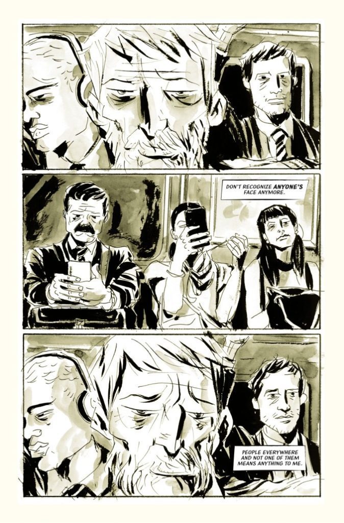
Jeff Lemire keeps his plot close to the chest for Mazebook #1. This first issue introduces us to our protagonist and the devastating effects loss and grief can have. Lemire demonstrates this man’s life as a lonely routine, with no social life. He spends all of his time on physical autopilot while his mind trails off on memories of his lost daughter. Lemire’s portrayal of this man’s grief is so effective because it’s so familiar. Any form of sadness can throw us down this same spiral for a period of time. However, here it has completely consumed every aspect of a man’s being. Lemire juxtaposes detailed narrative laced with mourning against the minimal, short dialogue given by the protagonist. His inner turmoil just further drives him away from forming any relationships with those outside of his routine. This makes for a deeply effective and painful read.
While there is of course a potentially supernatural thread here at the end, Lemire hides this part for most of the book to build the tension for the next issue. After this, I absolutely intend to be there to see it.
Art Direction
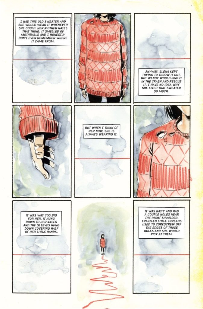
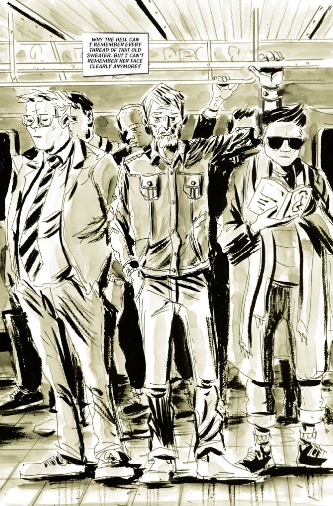
Jeff Lemire brings his signature unique art style to Mazebook #1. His rough-hewn, deceptively simple aesthetic provides immense detail to his characters. This especially goes for the main character. Lemire’s almost jagged linework creates an almost gaunt and tired visage for the protagonist. It also betrays the anguish going on inside his head. The panel direction and images Lemire uses are repetitive and detailed, increasing that feeling of never-ending isolated routine.
Almost the entire comic is bathed in this sort of sepia-toned color filter. This intentionally drains life from the world and characters to reflect the protagonist’s mindset. The only parts of the comic not like this are the scenes taking place in the protagonist’s head. Here there are a few more details fleshed out with color. Their inclusion actually makes the overall tone of the comic even more heartbreaking. The lettering from Steve Wands is not like any I’ve seen in anything but other Lemire comics. It’s a sort of thin, slanted font that is noticeably different from most other lettering styles. It captures the reading experience very well despite its subtlety. This is a brilliantly put-together comic from the visual end, a quality I would expect from a Lemire comic book.
Verdict
Mazebook #1 is an emotionally riveting and mysterious opening chapter. Lemire focuses on the emotional devastation of grief and how it ravages every aspect of a man’s life in an intensely sad yet relatable script. His visuals see him utilizing his unique style to show the wear on our protagonist and how bare his life has become just as his journey takes place. This is a brilliant and deep first issue, so be sure to grab it from your local comic shop today!

