Justice League: Last Ride #1, out now from DC Comics, shows us a possible future where the Justice League has disbanded, and many things are in disarray as a result.
Chip Zdarsky takes an interesting approach to introduce us to this new world in Justice League: Last Ride #1. A reader could get through more than a quarter of the issue before realizing that the story they are reading isn’t in current continuity. What’s so interesting about the story that Zdarsky presents us with is that the characters have not gone through a radical event that has changed them significantly from the characters we know. The world isn’t an entirely dystopian regime that has hardened our heroes or changed their ideologies; our heroes are the same as they ever were. Maybe a little sad and scared, but overall mostly the same. Justice League: Last Ride feels like a story DC would tell if they wanted to take a drastic turn in their continuity. The story is not too far along this deviated path in the timeline, so it does a fantastic job of making readers wonder where the story will lead and how much will change from what we know.

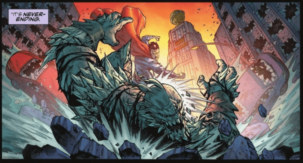
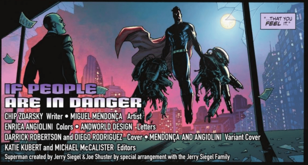
The art of Miguel Mendoça in Justice League: Last Ride #1 is gorgeous. There is tons of depth in panels that give the issue a cinematic feel, and Mendoça continually has characters and objects overlap the borders of a panel. This not only makes it so that these characters or items pop out more on the page and draw the attention of the readers, but it also has the effect of making the entire issue feel more immersive. Mendoça uses heavy shadows, which compliments the more somber tones of the issue, and overall
his work in the issue is what gives the somber moments weight.
One of Justice League: Last Ride #1‘s best aspects is its coloring. Done by Enrica Angiolini, the colors of the issue are not afraid to be bold, which helps place emphasis on specific moments and make the issue itself stand out. For example, when Superman is shown performing various heroic acts around the city, Angiolini decides to backlight him with a gorgeous sunset, which provides the moment with a certain amount of reverence. Angiolini also uses brightly colored backgrounds that don’t match the setting for certain panels as a way of helping the character express emotion and add energy to the scene.

AndWorld Design goes all-out in Justice League: Last Ride #1 and uses various methods to better express the characters’ manners of speaking. Examples of this include: expanding words past the borders of their speech bubble or making the border of a speech bubble bold to show that a character is screaming, making the letters of a sentence slightly misaligned to signify that a character is disoriented, and giving a particular word it’s own speech bubble to emphasize its importance.
Justice League: Last Ride #1 is an intriguing introduction to a world that only gives us as much information as we need and leaves us dying for more. The art, coloring, and lettering all come together to create some stunning visuals and an issue that quickly draws a reader into the series.

