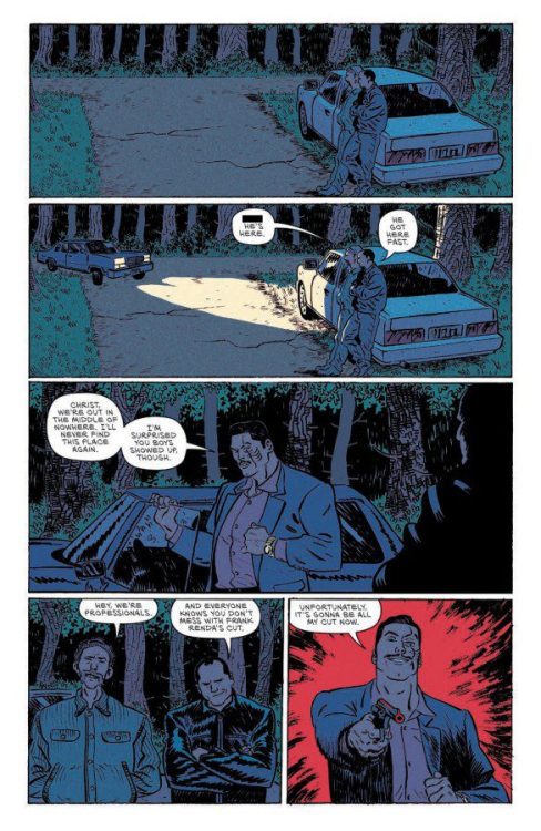
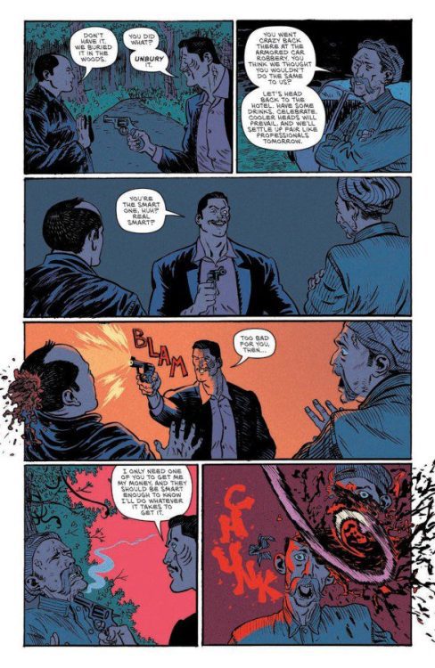
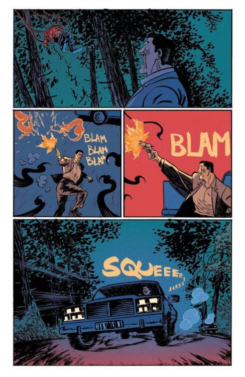
Writer Kyle Starks (Six Sidekicks of Trigger Keaton, Rick And Morty) and artist Artyom Toplin come together for a collage of farmhouse horror in I Hate This Place #1. Featuring colors by Lee Loughridge and letters from Pat Brosseau, this opening chapter fires a shotgun blast of monsters and ghouls at the wall for one of the most fun creature features in recent memory. With fantastic, tense scripting and stellar visual work, this is a must-read for fans of off-kilter horror comics.
“After inheriting a farm house, Trudy and Gabby are ready to start the next chapter of their lives together…except it’s already home to a mysterious force that’s attracted ghosts, aliens, and all kinds of supernatural beings for decades.”
Writing & Plot
Kyle Starks puts together an immensely fun script for I Hate This Place #1. Every aspect of the plot and dialogue feels measured while still coming off as naturalistic and tonally appropriate. Trudy and Gabby, our leading couple, both have perfectly distinct personalities and are a blast to read as characters. Their dialogue and mannerisms bounce off of each other in a way that mimics a real couple with excellent chemistry. The pair’s quirks and details all come about through Stark’s script naturally, making this one of the most fun married couples to read in recent memory. Their reactions to the insane crap that happens to them is calmer than one would expect, but it fits with the overall feel of the comic. Speaking of that insane crap, Stark throws a bunch of it out there and it somehow all lands. Like a mix of The X-Files and The Cabin In The Woods, this story takes a bunch of different horror monsters and lets the roam free in different spaces on this little farm land. The core concept that comes into play – living on this land and just dealing with these entities as just a part of the property – is both hilarious and terrifying. The most impressive part of Stark’s script is how easy it is to care about this couple and feel empathy and fear for them, in the midst of such an insane plot. This is a fantastic script from beginning to end, and I’m already eager to see the next issue.
Art Direction
A comic with as insane a plot as I Hate This Place #1 deserves an equally insane art style. Fortunately, Artyom Toplin is here to deliver. His pencils make for a distinct design aesthetic that works very well in this book. Toplin’s sort of left-of-center, off-kilter designs for monsters and characters make each face and locale memorable. Toplin’s style is like a mix of Ryan Browne and Regular Show creator J.G. Quintel, and this is said as nothing but a compliment. His compositions are sleek and smartly framed, making the pacing of this issue saunter along with tension while endearing us more to the characters. This comic’s horror exists because of how Toplin builds sequences, which is doubly impressive given the book’s wild plot. Lee Loughridge’s colors finish off the aesthetic with a dark spectrum of neon and vaporwave-style hues. His work in here is eerie yet fun to look at, which fits perfectly with the rest of the comic. The lettering from Pat Brosseau has a neat hand drawn feel in both the regular text and the SFX letters. Functionally, it does as expected and makes for an easy reading experience – but looks cool while doing it. Overall, this is a comic that will stick out on the shelf and in your mind after reading it.
Verdict
I Hate This Place #1 is a crazy horror concept that is greatly executed. Kyle Starks’ writing is loaded with fantastic character work, memorable monster-intros, and a surprising amount of tension considering how nuts the plot is. The visuals from Artyom Toplin and Lee Loughridge are vivid and memorable, doing a great job of setting the pace and crafting this comic’s unique horror light-horror atmosphere. Be sure to grab this new issue when it hits shelves on May 18th!

