Godzilla Rivals: Vs. Hedorah, out now from IDW Publishing, is full of engaging kaiju action and human characters that are easy to care about.

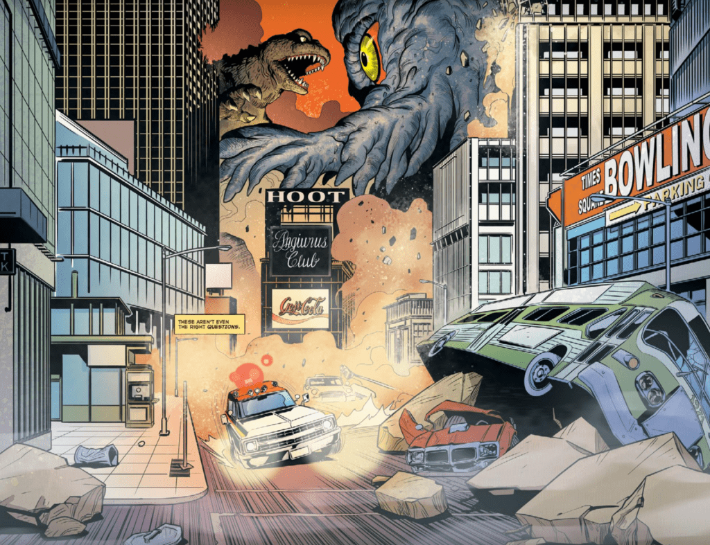
When talking about Godzilla stories, people will go on and on about how they didn’t care for the plot involving humans, and they only want to see the giant monsters fighting each other. Godzilla Rivals: Vs. Hedorah will have you thinking differently, thanks to the incredible writing talents of Paul Allor. The first way that Allor makes the reader care for the human characters is by making them pivotal in the fight against the monsters while also putting them in a situation similar to average civilians suffering from the collateral damage of the kaiju’s battle. The issue follows Todd as he drives through the destruction of New York City during the conflict between Godzilla and Hedorah, trying to get an injured Dr. Kovats to a hospital because she is the only person who knows how to stop the kaiju. This combination of an important role and danger for the characters makes worrying about them easier. Another way that Allor endears us to the characters is through the casual manner they communicate with each other, showing the strong relationship they have. This happens when Dr. Kovats says that it isn’t “right” for Todd to save her, to which he replies by saying, “Okay, you ding dong.” It’s great to see characters still retaining a sense of humor in an otherwise intense and serious story. Allor’s excellent story goes far beyond creating likable characters. The issue contains several unexpected twists, heartbreaking moments, and stunning kaiju action.

From a comic book like Godzilla Rivals: Vs. Hedorah, the thing you’d expect most from the art are images of thrilling blows exchanged between the two kaiju, and E.J. Su delivers that and a whole lot more. The design used for Godzilla in the issue isn’t the most threatening, but Su makes both monsters absolutely terrifying by emphasizing their sheer size. One panel features foreshortening of Godzilla’s tail while it is a great distance away, and its size compared to our main characters helps the reader grasp how minuscule and helpless they must feel. Su also makes the characters’ faces highly expressive, making it easier to understand their emotions and empathize with them.
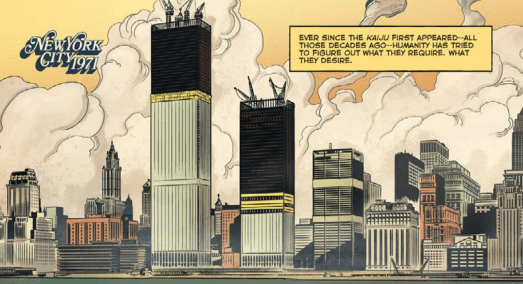
Godzilla Rivals: Vs. Hedorah is an intense experience because of Adam Guzowski’s coloring. Our first panels of New York City are given a realistic palette that reflects the grim nature of the destruction brought by the kaiju, but Guzowski’s talents shine brightest when not using a true-to-life palette. Guzowski continually uses single-colored or gradient backgrounds that don’t match the setting but instead reflect the tone of the moment. For example, a blood-red background when Godzilla is striking Hedorah adds an intensity to the moment that makes the issue more thrilling. Guzowski uses this technique many times, whether during the enormous fight scenes or important moments with the human characters.

Nathan Widick is not afraid to be bold with his lettering choices in Godzilla Rivals: Vs. Hedorah and the issue benefits significantly from this. For instance, when the main characters come close to being crushed by Godzilla, the sound effect “SMASH!” covers a large portion of the panel and extends past the panel’s borders, emphasizing the volume of sound resulting from this action. There is also a red outline surrounding each of the letters in the sound effects, which causes the scene to seem more violent.
Godzilla Rivals: Vs. Hedorah may be the best Godzilla comic I have ever read (and I’ve read a lot because I love kaiju.) There isn’t much Godzilla media that causes you to care so much about the human characters, and Su’s art does an impressive job of emphasizing the gargantuan size of the monsters.

