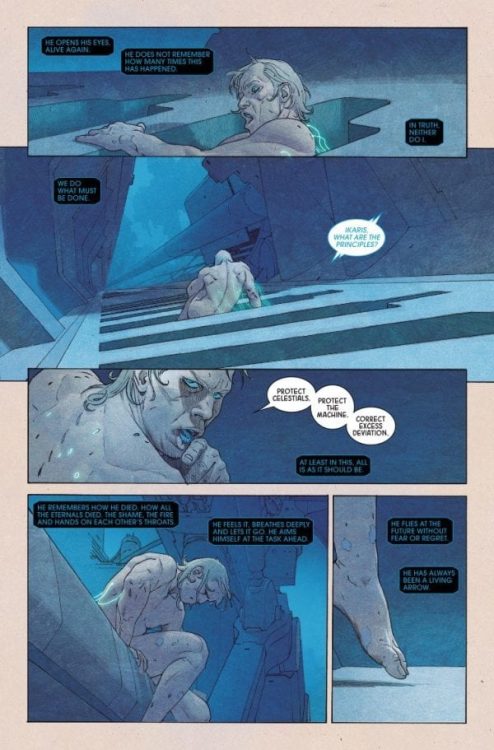
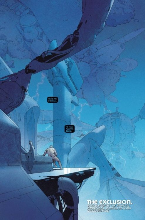
ETERNALS #1, out this week from Marvel Comics, is the debut issue of an ongoing series by writer Kieron Gillen, artist Esad Ribic, colorist Matthew Wilson, and letterer Clayton Cowles. This first issue introduces new readers to the Eternals’ backstory and world effectively while keeping things fresh for the hardcore fans with a humoristic take on the god-like characters.
Writing
As a first time reader, I’ve personally enjoyed Kieron Gillen’s take on these characters. Although, to be honest, it took me additional reads to truly appreciate it. Going in, the reader expects an epic, grim tale about war, gods, and demons- a tone which all of us are already familiar with. But instead, what the reader gets is an exchange of witty banter between the characters, deadpan humor, and a fourth-wall-breaking narration, which elevates the story’s quirky tone. Even with a murder mystery taking place in the last few pages, the story still manages to amuse and entertain.

All of this made the reading experience a lot less daunting and intimidating. Also, Gillen took the time to explain some basic elements and history, which made the new readers feel not left behind. He also threw into the mix some well-known characters to create a sense of familiarity with this world. Personally, I’m excited to see where Gillen is going to take the story next.
Art
In perfect contrast to Gillen’s off-kilter story, Ribic’s artwork looks larger-than-life. The backgrounds usually look well-detailed and beautiful; The way in which the characters are drawn makes each character feel majestic and phenomenal, and the action sequences- the way they’re paced- manage to keep the reader engaged and interested in the fight. But most importantly, Ribic decides to focus on the character’s facial expressions in Eternals #1 to complement the offbeat tale. Each facial expression has an emotional weight to it but also makes the jokes land even better—incredible work from Ribic.
Colors
Wilson’s colors definitely complement Ribic’s artwork and make each page look all the more extravagant and fantastical. Wilson usually colors the backgrounds in a monochromatic manner, which helps the reader keep track of each new place. But, when he wants the reader to feel something specific, Wilson knows exactly which colors to use in order to extract this emotion out of the reader. For example, during the action sequences, Wilson uses the few light sources available to him to his advantage, elevating the dramatic tension. But, when the more light-hearted scenes take place, Wilson uses the sunlight to give the readers a sense of warmth and friendliness.

Lettering
Clayton Cowles’ (Whom Zac Owens and I had the privilege to interview last week) lettering is top-notch. The caption boxes’ octagonal shape immediately lets us know the narrator is an AI/robot; Cowles also places the captions and the balloons in a way that never distracts the eye. All in all, Cowles’ lettering is effective and elevates the art’s look and feel.
Conclusion
In the hands of less passionate, experienced creators, this tonal battle between the art’s regal look and the story’s quirky mood would have created a royal mess. But, somehow this battle seems to work brilliantly, each element playing off the others’ differences. Eternals #1 sets the series off to a great, fascinating start. Strongly recommended.

