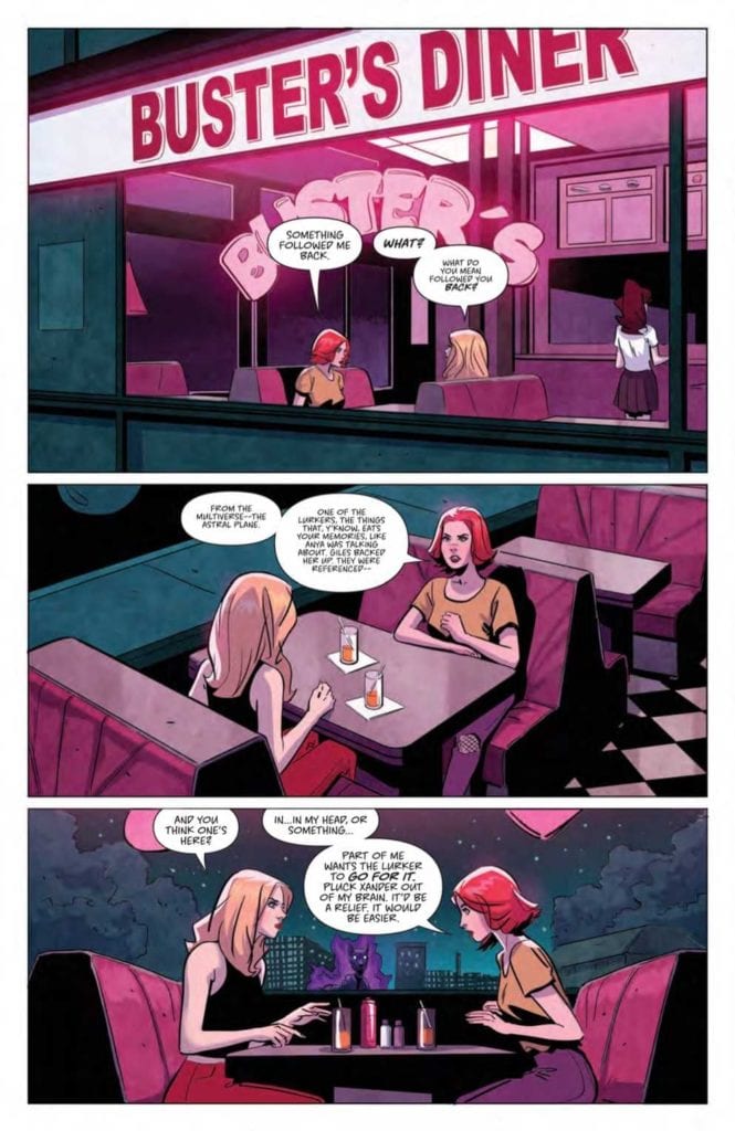
If we learned anything from Ghostbusters, it’s that you should always look out for demonic dogs. That demon dog might actually be your best friend. Available now from Boom! Studios, Buffy the Vampire Slayer #26 deals with the immediate aftermath of last issue’s ’90s multiverse weirdness. Returning writer Jeremy Lambert teams up with new illustrator Marianna Ignazzi of An Unkindness of Ravens fame. Also returning are colorist Raul Angulo and letterer Ed Dukeshire.
The previous issue gave us only a sampler for what messing with the multiverse can do. Now Willow’s got a ghost demon dog stalker, Anya’s true motives are up in the air again, and the art style has reverted us to the ’60s. It’s a whirlwind for sure, but the basic plot keeps us trucking along with the Scooby Gang.
Lambert’s pace speeds up and slows down, seemingly as dictated by page count. Twenty-four pages may sound like a lot in comic book terms, but it hardly gives readers time to breathe, let alone the characters. Is this entirely a bad thing? No, the fast pace keeps things exciting. However, for the long-time reader, it’s like speeding down a scenic route. How are we supposed to immerse ourselves in the world and characters when we spend the movie equivalent of half a second on getting real?
Artistic Differences
Despite my frustrations over the fast pace and plot focus, I believe Lambert does his best in striking the right balance within the constraints. We still care about these characters, and the plot is strong enough to sustain readers long-term.
On the illustration side, Pinti’s ’90s style character design is out and replaced by an older, late-1960s look by Ignazzi. What this means is everybody looks vaguely like a Hanna-Barbera cartoon character. This is a fun change, but the style falls short in recognizing Ethan and Wesley. I had to do a double-take because the face shape or hair wasn’t quite what I was used to. Nonetheless, the new style adds to the sense of warped time and space in the multiverse.

Colors and lettering follow Ignazzi’s ’60s style in their own way. Angulo uses less purple, red, and blue than usual in favor of dull brown, gray, and black, which signal the issue’s sinister tone. The darker colors are also practical as this issue involves less action and more sit-downs in offices and the like. Moreover, these less saturated colors contribute to the dusty, ’60s color TV look.
Looking Sharp
Letter Dukeshire uses small tweaks to great effect. He uses SFX sparingly but with sharp edges while the dialogue bubbles are mostly centralized to let the eye flow down and naturally leave ample room for action to speak louder than words. Overall, Dukeshire’s lettering is smooth and symmetrical. If I can say one thing on behalf of long-term Buffy readers, I’ll say Dukeshire’s been a reliable constant that makes up for any writing or aesthetic-related inconsistencies.
We may not have seen much of the multiverse, yet we know its effects are here to stay. But multiverse hiccups are only one of many obstacles on the way to facing the “big bad” that Anya’s been teasing. Is it the mayor, perhaps? Or someone else that the council is puppeting? Whatever it is, the Scooby Gang has to overcome their squabbles to fight it. Buffy the Vampire Slayer #26 keeps us on our toes as we look forward to the next reveal.

