Note: this article includes some minor spoilers for Stillwater #1. If you want to get the best experience out of the comic, don’t read anything about it. Buy it and read it first. Then come back here or check out the MFR review.
Setting a scene is important. Not just because it gives the characters a location to inhabit but because it can create a tone for the story. The setting is important for mood, for genre, and for highlighting characters. The location for a story and the way that it is depicted is as much a trope as a trench-coat wearing detective. The opening sequence in The Walking Dead is as much about the world Rick wakes up in than it is about Rick himself.
In a medium where we talk so much about character and action, it is easy to overlook the locations. However, the setting leads the reader through the narrative, signposting the genre through recognisable motifs and creating a mood that enhances the foreground action.
In Stillwater #1, published by Image Comics, Chip Zdarsky and Ramon K Perez use a changing landscape to reaffirm the central characters’ journey and draw the reader into their pseudo horror story.

Cold Introductions
The first issue of Stillwater is a classically framed opening for a horror story. As to where the series eventually goes may be somewhat different but for the introduction Zdarsky and Perez have adopted a familiar journey. Their two main characters, one down on his luck and the other too rich to care, are mysteriously summoned to a small, out of the way town, by the promises of an inheritance.
The journey takes the characters from the urban sprawl to a quiet backwater and the changing landscapes really tell the story. One is sterile, uncomfortable and violent while the other is serene and laid back, however every horror fan knows that the grass is never greener. The contradictions between the scenery and the experiences of the characters is the mechanism that gives Stillwater it’s narrative punch. The opening scene is a perfect example of the contradiction inherent throughout the comic.
Daniel is at work, in an open plan office surrounded by fellow co-workers. It is a scene that many will identify with and must surely be a safe space. Everything is open and bright. Nothing every bad happens during the day, especially not at a mundane place of work. But if you look closer at the panels not everything is at it seems. The office is open plan but Daniel is still cut off from the rest of the workers. His desk is a physical barrier between him and everyone else; he has oversized earphones on cutting him off from the office chatter; and his name, our introduction to the character, is placed beside a large red wall hanging, the only vivid color in the room.
Letterer Rus Wooton places the speech balloons above and below the red painting which emphasises the placement and draws your attention to the vivid warning color. The added border of yellow around the second shout of the characters name gives extra weight to the interpretation that not all is as it seems. Far from being a safe place, the first panel actually insinuates that something bad is about to happen.
As the page progresses and we learn that Daniel is in trouble with his boss and the character becomes further isolated by the scenery. The red wall of the manager’s office surrounds Daniel putting him under threat. The distance between him and his Boss is exaggerated by the comparison between the different sides of the room: on one side is furniture and personal belongings which create a sense of permanence, on the other is a flat red wall with blank, white paintings, unwelcoming and empty. There is a clear division in one panel created by the desk and a cleverly placed plant, separating the characters. The panel is also silent because no words are necessary: this is clearly a man getting fired.

From City to Country
In the opening scene the writer/artist uses the backgrounds to enhance the character interaction. As you move through the comic, you come to realise that the scenery also feeds into the greater narrative in a similar, but more expansive, way. The growing tension and the sense of unease that the story relies on comes from the changing landscape.
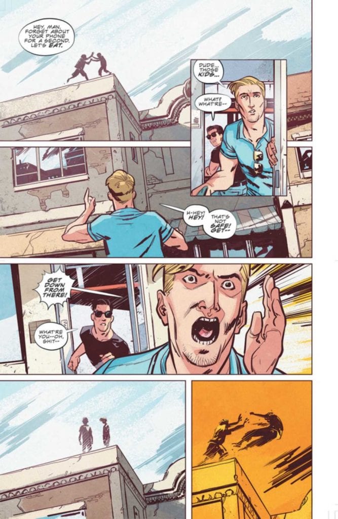
Daniel lives in the city. Zdarsky tells us through the plot that it is a dangerous and violent place. In turn Perez gives it a kind of grittiness however it is not uninviting. Mike Spicer throws a cool pink light across a nightclub scene, highlighting the characters against the grey backdrops. Despite the conflict evident on the page there is a comfort to the location, as if Daniel is at home in this place. This theme is continued into the next scene which is literally his home. He wakes up wrapped in blankets, his friend comfortable on the floor playing a games console, the warming sunlight drenches the scene.
It is a safe place and still clearly the city. The architecture and the greys in the background link Daniels apartment to the nightclub of the previous night. It is an aggressive place but one that is familiar to the characters and therefore desirable to them.
All of this is about to change with the arrival of the unassuming, little old man.
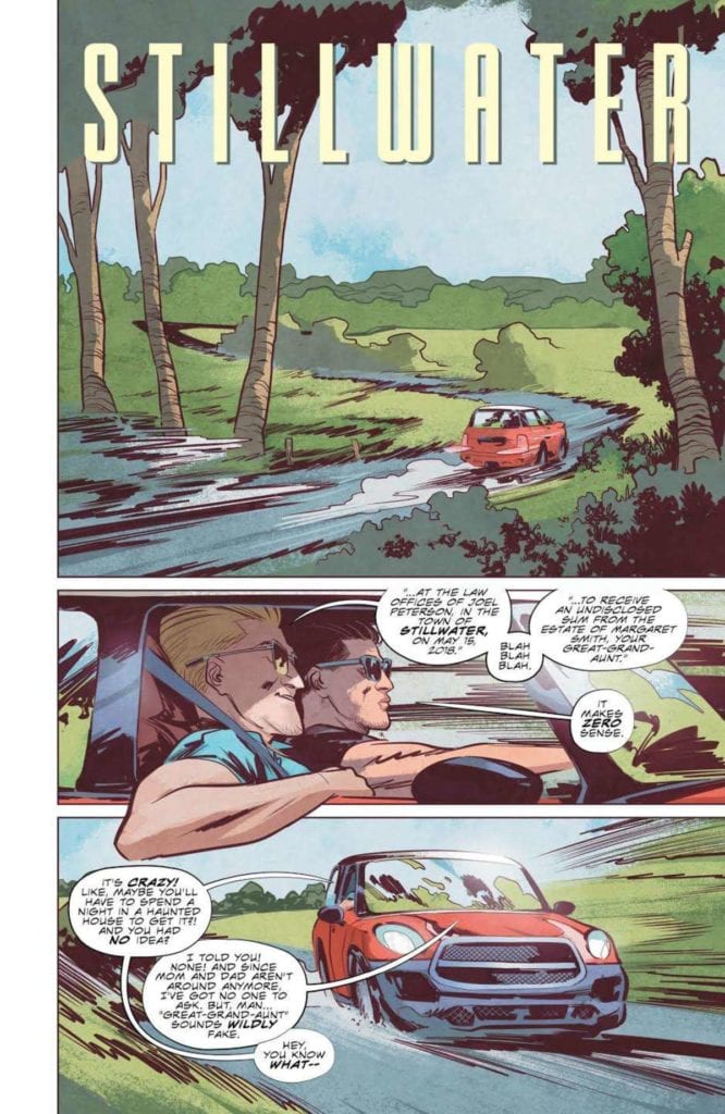
A classic unexpected inheritance is the catalyst for the story and forces Daniel and Tony to embark on their road trip. From this point onward the importance of the landscape becomes unmistakable.
Think of any horror movie or comic where the protagonists journey into an unknown location. In every single one, the change from their home, their place of safety, to the dangerous location is represented visually. The classic is the switch from the city to the county. From Evil Dead to Cabin in the Woods, 30 Days of Night to Winnebago Graveyard, the contrast of locations fuels the tone of the narrative.
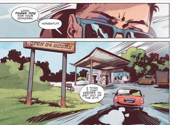
In Stillwater Perez contrasts the rigidness of the city with a free flowing, expressionistic countryside. From the moment the characters leave the urban setting Spicer’s colors become softer, greens and light browns, but there is an overbearing element to the panels and pages. Perez changes the reader’s viewpoint, moving it lower so that we are constantly looking up at the surroundings. This gives the impression of the landscape towering over us, trapping us. This is often a feeling people experience in large cities surrounded by skyscrapers, so to invoke that feeling in wide open spaces is telling of the situation. There is a moment of discomfort as Daniel drives up to a local gas station because the forecourt stretches over the reader like the lid of a box. And the further into the wilderness the two men drive, the more oppressive the landscape becomes. Perez uses dutch angles, low angles, and a lot of over the shoulder shots in order to make us as uncomfortable as possible.

Unnerving outcomes
By the time Daniel and Tony reach the town of Stillwater, we already know that there is something different, something wrong with this place. Long before the unusual actions of the townspeople fill us with dread, the location has us longing for Daniel to turn around and go home.
The horror tropes are there, within the narrative but as with so much of this genre it’s the presentation that marks a title out. Zdarsky, Perez, Spicer, and Wooton encapsulate the readers expectations of a horror story in dramatic ways. They build a visual landscape that reflects the unnerving narrative so that one aspect feeds beautifully into the other. Simply put, it’s engrossing. This is exactly what you need to make the jump scares work, especially in a comic.

