Alright, that’s quite a headline for you. Probably sounds a little ridiculous when you read it, right? But no, DC Comics’ Superman and the Authority #1 really is something to behold. It’s the best version of what it could be, with plenty of hints at incredible things to come. Writer Grant Morrison brings us the trippy, edgy, whimsical writing that they’re known for. Artist Mikel Janin, with colorist Jordie Bellaire, and letterer Steve Wands, turn Superman and the Authority #1 into the start of a new mythology.
Writing
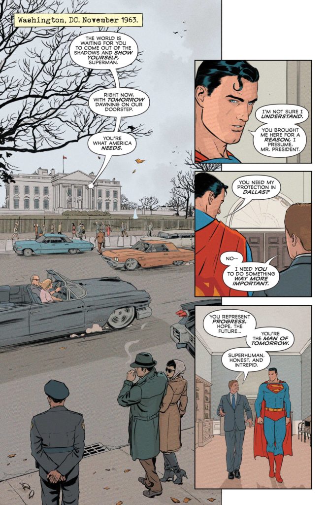
Morrison’s writing oozes with a love of the medium. Even when they’re breaking the rules of writing, they’re doing it in a way that is drenched in enthusiasm. We bounce around time in this issue. Morrison shows us scenes of Superman chatting with JFK before bringing us back to the modern day, where we catch up with Manchester Black. It’s a brilliant juxtaposition. We see what’s often considered a golden age in history, written in all its glory. Morrison’s Kennedy is a man who is full to the brim with ideals and driven by an excitement for the future. He’s the Kennedy people dream of: the spirit of a nation struggling to be better. He’s Superman, if Superman were president in 1963.

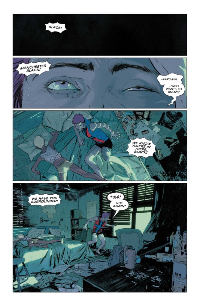
When Morrison introduces us to Manchester Black, he’s the very opposite. Black is disgusting. He is disingenuous, disengaged and disillusioned. He wants nothing to do with anyone and would be happy getting pissed drunk on his own in a grungy apartment. But quickly, that becomes impossible. Black is forced out of his hovel, and he is picked up by Superman and taken away. When we see Superman, he’s still got that belief in him, the belief that JFK put there. He believes in the things he promised to Jack Kennedy. But those beliefs are buried under years of disappointment. He lists them off: “After that day, it all came down like dominoes–Bobby Kennedy–Martin Luther King–The Space Race–Intergang–Darkseid–Doomsday.”
With this list, Morrison seamlessly blends real history with the history of the DC Universe. It’s so simple, yet so effective. And as the issue goes on, the stakes grow to what can only be described as “Morrison-esque” proportions. Zonedroids, Thought-beasts, and clandestine meetings give us a taste of Silver Age style comic book shenanigans. Superman explains the stakes in wordy exposition dumps and Manchester Black announces his powers before using them. It would all fall flat if it weren’t written by the giddy pen of Grant Morrison. Their love of this medium turns each of these moments into a joyful callback to the comics of old. Morrison channels their best Jack Kirby impersonation and pulls it off with flying colors.
Art
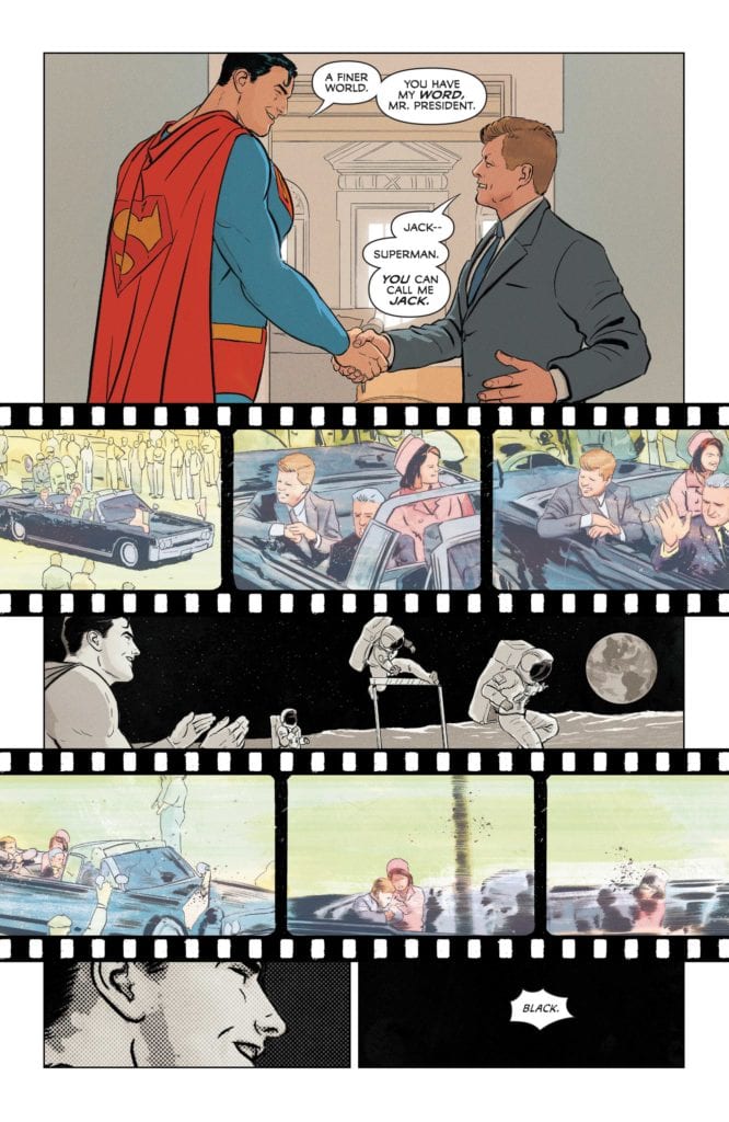
Janin’s art is stunning, through and through. But, above all else, it is constantly adapting in this issue. The Superman of the first few pages is deeply different from the Superman that shows up later on. When this issue begins, everything is picturesque and beautiful. JFK and Superman stand in panels symmetrically. Nearly every panel looks as though it could be a magazine cover. But then it all ends. Janin interrupts the page with footage reels. We see the assassination of JFK, placed around images of man walking on the moon. Superman looks on at the astronauts, applauding and smiling. As the footage of JFK’s death ends, we zoom in on Superman’s smiling face again. No words are needed, the subtext is clear. “It was a simpler time,” it tells us. Janin is depicting the death of Superman’s innocence. He’s showing the turning point of the world.

The next page confirms as much. We get a close up of Manchester Black’s eyes rolling open from an alcohol induced-coma. His shitty apartment and the violence of his altercation with the military would be enough to tell us times have changed. But it’s not that that seals the deal. It’s Superman’s arrival. He appears like a black ghost. Janin depicts him almost like a disembodied spirit. His anger at history’s decline is as clear as his red eyes burning through the night. But with all this doom and gloom, Janin balances it with idealism. Superman’s Fortress feels like it houses the building blocks of utopia. It’s in here that we see the angry idealism of Superman clash with the apathetic disillusionment of Manchester Black.
Coloring
The image Morrison and Janin give us of the 1960’s may be idealized and beautiful, but Bellaire also creates a distance to it. The colors are muted. All except for Superman, who stands out in brilliant red and blue. But overall, the scene feels almost as though it has paled with time. It’s a vision of the past that is firmly aware that it’s set in the past. But it also lends Superman an immortal quality. Even as he and JFK walk down the hall, they pass a photograph of the JSA. The image is brown with age, discolored by time. But Superman is young and bright.

While the modern scenes have more of a brightness to them, vibrant color often shows up in disturbing situations. Bellaire colors the nightmarish visions Manchester Black gives the military in a bright red. And when Black is shot full of holes, the background panels are blue and red. They almost form a twisted, violent Union Jack, like the one on Black’s chest. And as the issue goes forward, the colors become more and more deep. Whether it’s the red glow that Superman’s heat vision bathes the room in, or the green lights that herald an oncoming danger, it’s all incredibly colorful. Bellaire’s coloring is moving and fantastic!
Lettering
There are so many fun moments in Wands’ lettering. And surprisingly few of those moments are sound effects, though the “Plenk,” and “Kkk-kzzrk” of Manchester Black being electrocuted is both funny and cathartic. No, Wands shines most in the details. The captions or datelines on each page are written like they were done on a typewriter. Wands makes this whole issue feel like it came out of some government file. And as Superman is fighting off Zonedroids, with Manchester Black walking out into the snow, Black’s word balloons are incredible. At first, he talks. We see the scribbled interior of the balloon, showing us his words are unintelligible. Then, he speaks briefly again. “*” is all that’s written. Finally, he shouts, but the word balloon is empty.
And just like that, Wands turns a small scene into something memorable and hilarious. But it’s throughout the whole issue that he’s constantly adapting. Fonts grow and shrink. Words fade out into grey. Wands is using everything in his toolbox to create rhythm, style and even humor. And he’s nailing it.
DC Comics’ Superman and the Authority #1 is just perfect. It’s all the bombastic, thought-provoking scripting you want from Morrison. It has all the gorgeous visuals and dynamic style you’d want from Janin. Bellaire imbues every scene with meaning and flare. And Wands’ specialty is found in the details, making it all work together flawlessly. Superman and the Authority already promises to be an amazing series. It’s a comic about people aiming for lofty goals. Funny, because it surpasses all goals I’d set up for it in my head. Pick up Superman and the Authority #1, out from DC Comics July 20th, at a comic shop near you!

