JULIET TAKES A BREATH, out now from Boom! Studios’ imprint, Boom! Box, is the graphic novel adaption of the novel by writer Gabby Rivera.
With art by Celia Moscote, colors by James Fenner, and letters by DC Hopkins, Juliet Takes A Breath is a beautiful, brave story that refuses to shy away from discussing uncomfortable topics like race, gender, and identity.

Writing
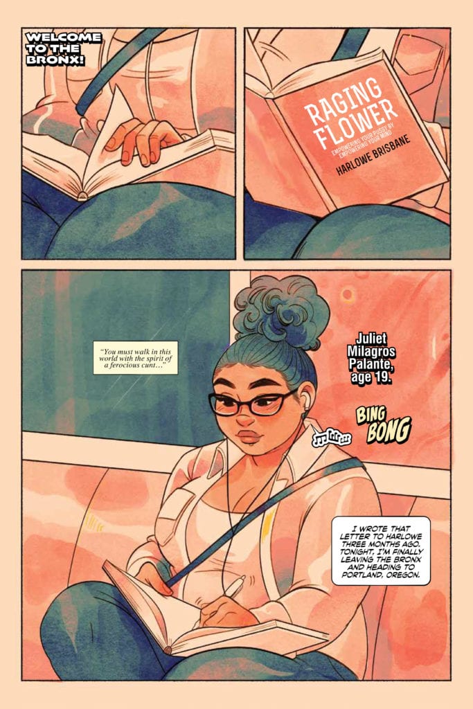
Rivera’s writing especially shines when Juliet, the titular character, dares to question everything around her and criticize certain social norms. Right from the start, we read an email sent by Juliet to Brisbane Harlow, her new feminist role model. The email is full of adoration towards Harlow, but Juliet is never afraid to talk about how she feels regarding the book and its lack of representation.
As the story progresses, Rivera reveals quite brilliantly that just because Juliet questions everything, it doesn’t mean that she has all the answers. Juliet is flawed, too. At times, the reader even learns together with Juliet about some things they might have been completely oblivious to, like pronouns or feminist history, or subtle racism. This liberates the reader from the feeling of being judged when Rivera makes the reader ask themselves some hard questions about their own behavior in some of the pivotal events in this book. It might feel uncomfortable to some, but that’s what great art does. It forces you to put a mirror in front of yourself and confront who you really are.

Art
I personally could talk endlessly about how I much adore Moscote’s gorgeous art and Fenner’s lovely coloring. But over the following sections, I’d like to zero in on my favorite moment of Juliet Takes A Breath to give an excerpt of how much thought has been put into every single page of this graphic novel.
Well into the story, there’s a poignant moment where Juliet’s girlfriend breaks up with her over a letter after being apart on different internships. There, to tell the reader how Juliet feels, it would’ve been easy for Moscote to show Juliet’s facial expressions. But, Moscote bravely decides against that. Instead, they turn Juliet away “from the camera” and use only Juliet’s body language and the background to convey her feelings to the reader. There are almost these tentacles of sadness creeping into the panels in the background until they almost swallow Juliet whole.
Coloring
To help Moscote emphasize the emotional weight of this break-up on Juliet’s psyche, Fenner starts coloring the first panel’s background in bright pink as Juliet opens the letter. But, as these tentacles of sadness take over, the background colors turn more grim and dark, making the reader feel as if they’re trapped there with Juliet. Behind Juliet (or in her), there’s still light- there’s still happiness. Although, Juliet’s light slowly begins to suffocate and die down.

Lettering
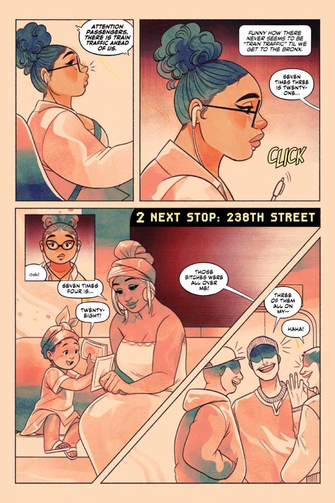
Hopkins’ lettering joins in on the fun and experiments throughout the graphic novel while remaining consistent. Some sound effects look timid and don’t attract too much attention, and some leap out the page beautifully. Each element has a consistent font. Hopkins places the balloons and captions well and never confuses the reader. Every font looks to be carefully chosen and helps to elevate this graphic novel’s fresh, young vibes. Great work here from Hopkins.
Conclusion
Juliet Takes A Breath is a wonderful, unique graphic novel. The story is a bold tale about race, gender, and self-acceptance, and the art’s vibrant style elevates the story’s fresh vibes, distinguishing it from other graphic novels that came before.

